CVS HEALTH
What problem did I solve?
The design of the Glucose Lab Test results was poor and inefficient because:
-
Lab test results were unclear.
-
There were no doctor's recommendations.
-
Heavy usage of clinical jargon lenguage.
-
There was an increase of 67% of customer service calls due to unhappy patients.
How did I solve this problem?
I designed an end-to-end experience. From user search to success analytics, in tight collaboration with a multidisciplinary team I proposed and implemented a data visualization solution that increased patient satisfaction and improved success metrics.
Project Impact
Client
CVS Health
Platform
Responsive web
My role
UX/UI Strategy
Stakeholders
Product owner, Content strategist, Accessibility team, Engineering team.
CONTEXT:
CVS Health provides a variety of health tests to its customers, including the A1C Hemoglobin test, which monitors blood sugar levels and aids in diagnosing different types of diabetes.
However, customer feedback highlighted concerns regarding the clarity and practicality of the test results.
I partnered with a multidisciplinary team to redesign this test result experience using Agile.
Discovery phase


Discovery phase
WHAT WAS THE PROBLEM WITH THE OLD TEST RESULTS?
-Unclear test results.
-No doctor's recommendations
-Clinical language
WHAT WAS THE BUSINESS IMPACT?
-CVS pharmacy customers lost trust.
-Customer service calls increased by 67% because people were upset that the results were not useful at all.
-I partnered with Adobe Analytics teams and learned that the Bounce rate was super high at 73%.

Discovery phase
IDEATION
Spending some time thinking about multiple solutions to my design problem.
Here I generated 3 concepts, socialized them, and got fast feedback to reiterate later.

Design phase.
Low fidelity
EXPLORING DATA VISUALIZATION
I felt that data visualization could be an effective tool because we had some complex data that could be turned into easily digestible and engaging visual representations of the test results.
DESIGN RATIONALE
-I used circles because they represent quantitative info effectively.
-I felt that our patients could find value in seeing not only the latest test result but also any previous result for comparison.

Design phase.
Low fidelity
ANOTHER DESIGN EXPLORATION & PROBLEM SOLVING
ACCESSIBILITY ISSUES:
The color palette presented accessibility compliance issues, with certain color combinations failing WCAG AA standards. Additionally, the engineering team raised concerns regarding the accurate representation of blood sugar percentages via a color gradient. I collected feedback and reiterated.

Design phase.
Low fidelity
USABILITY TESTING:
Our user researcher performed a usability test, and here is some of the feedback:
GRADIENT BAR: The colors at different points don't provide sufficient contrast against other elements, making it difficult for users with visual impairments to read.
VIRTUAL CARE NEEDED: Users noticed that, as part of the Care options we offered, there wasn't a way for them to receive virtual care.
Design phase.
Medium fidelity
HOW THE DESIGN EVOLVED:
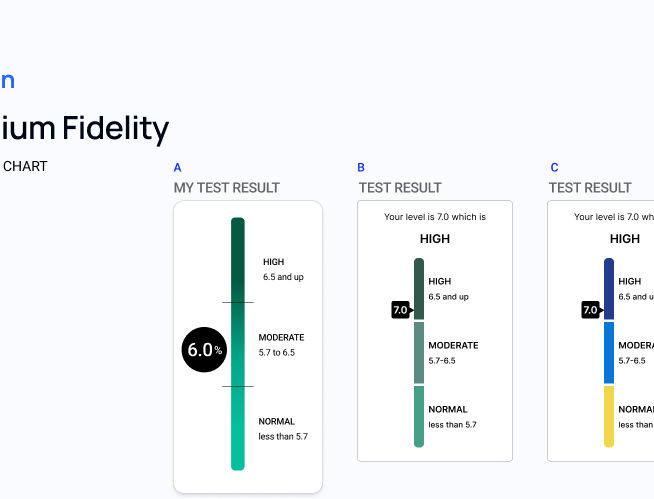
Based on user feedback, I realized that the data visualization horizontal bar should be designed in a way that can fit more labels or information so you see the vertical new design here.
DESIGN RATIONALE:
-Why a green palette? Green is associated with health care, and it has a calming effect.
-On exploration "B" I removed the divider and instead used white space to separate the three segments.

Design phase.
High fidelity
WHY IS THIS DESIGN BETTER THAN THE PREVIOUS?
-Accessible color palette.
-Vertical data visualization bar is optimized for mobile screens.
-Solid blue colors add more clarity to the test results.
HOW THIS DESIGN MET THE OBJECTIVES:
-There was a 16% boost in conversion rate when users downloaded the test results as a PDF.
-Session duration increased by 24%
-Click-through rate for some links also increased by 33%.

Design phase.
High fidelity
HAND OFF TO ENGINEERING TEAM:
-I make it a habit to present final designs to the engineering team.
-I post annotations on the Figma file or on the Confluence platform.
-Annotations include components, interactive behaviors and visual design guidelines.