CITIBANK
Through comprehensive user research, the leadership team identified the need to allow Citibank credit card holders to block their cards in case they lose them. Using Agile methodology, we created an end-to-end user experience.
Tools
Figma, Miro, pencil
My role
UI/UX
Platform
Responsive web and iOS
Stakeholders
Full product design team.
OVERVIEW
The design team in partnership with Citibank business teams learned about the need for credit card customers to quickly and efficiently report a lost credit card. In response, the design team, following Agile methodology, was tasked with creating a seamless, end-to-end user experience to address this critical issue.
The project involved user research, discovery, low and high fidelity design, testing and delivery.
Discovery phase


PROBLEM STATEMENT
"Citibank Double Cash card holders frequently misplace their credit cards, leading to unauthorized transactions and stress. The current process of blocking a lost card is slow and requires people to call customer service. This results in delays, security risks, and frustration. A seamless mobile & desktop solution is needed to enable quick card blocking, reducing financial risk and improving user confidence."

Discovery phase.
Concepting
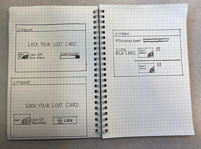
After getting team alignment of design requirements, I kicked off my design process with some concepts. I shared them with design and engineering team during daily stand-up meetings.

Discovery phase.
Competitive Analysis from Bank of America.
What I learned:
-Bank of America presented the "Lock your card" feature under the Manage credit card settings.
-The feature was easily accessible from a list of other options.
The image of the credit card and the list of tasks associated with it were well-balanced visually.

Discovery phase
User flow
These are some of the questions
I kept it on my radar as I created this preliminary user flow:
-Are there potential friction points that could slow users down?
-Where can we eliminate unnecessary actions or simplify interactions?

Design phase.
Low fidelity
EXPLORING PLACEMENT
-I felt it was logical to place the entry point near the credit card that was reported lost.
-The landing page was dense so to reduce cognitive load I positioned the link at the bottom of screen and added an icon to catch user's attention.

Design phase.
Low fidelity & problem solving
DESIGN SYSTEMS EXTENDED
The design system was missing an accordion component for mobile platform. This was work in progress of my proposal for a mobile accordion. I kept in mind usability: downward arrows to indicate expandable sections, focus state for keyboard, ARIA attributes for accessibility.

Design phase.
Medium fidelity
DESKTOP PLATFORM
Regarding hierarchy, my goal was first to guide customers through the screen and inform them what to do if they lost the card, and then take action by using the toggle.
PROBLEM SOLVING
The design system lacked a desktop toggle component with labels, which I identified as a gap. I designed the component, ensuring it met usability standards, and successfully secured buy-in from the development team.

Design phase.
Medium fidelity
COLLABORATING WITH ALL STAKEHOLDERS, IN PARTICULAR ENGINEERING TEAM.
-During prototyping I noticed I used the wrong size of a card image. I wanted to start building a relationship with the front-end developers, so I reached out to them, and they provided me with correct assets to use for this experience.
Design phase.
High fidelity
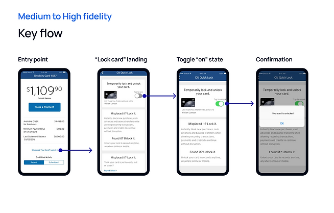
I created a user flow to illustrate how customers would interact with the experience.
HOW WERE PROJECT GOALS MET?
-Following the feature launch, the analytics and metrics team observed a significant increase in customer engagement with this functionality.